EXERCISE - Drawing a map
Draw the map of the ground floor of Cnam Conté (10min).
Compare to the actual map (provided in class)
Introduction
Visualisation is any technique for creating images, diagrams, or animations to communicate a message. Visualization through visual imagery has been an effective way to communicate both abstract and concrete ideas since the dawn of humanity (wikipedia).
EXERCISE - Drawing a map
Draw the map of the ground floor of Cnam Conté (10min).
Compare to the actual map (provided in class)
Exemples
Cartography: The Ptolemy world map, reconstituted from Ptolemy’s Geographia (circa 150) (source: wikipedia)

History: Charles Minard’s information graphic of Napoleon’s march (source: wikipedia)

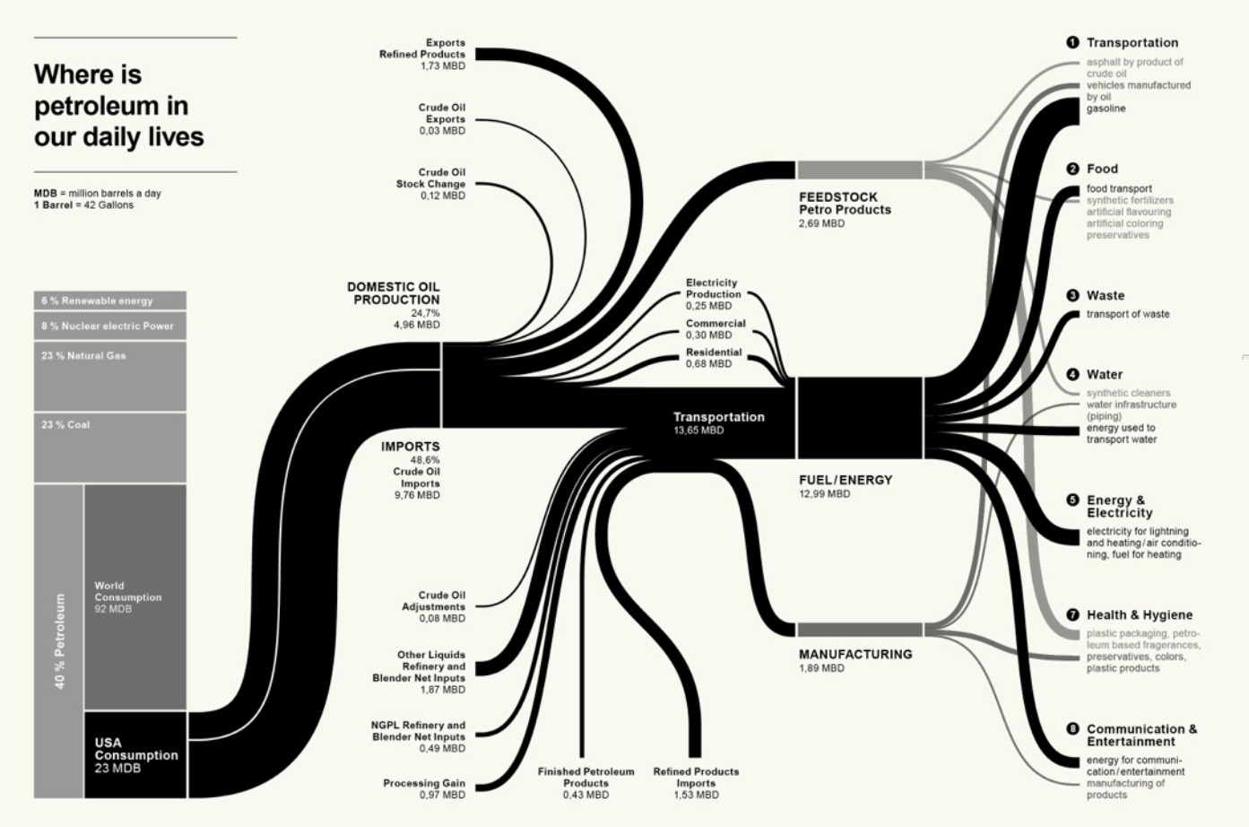
Socio-economy: Petroleum flow:
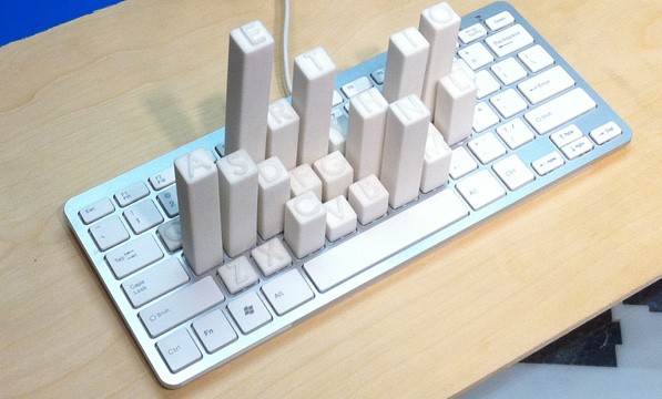
Physical dataviz: Keyboard Frequency Sculpture (source: https://dataphys.org)
Cortex Man - Sensory Model & Motor Model: (source: https://www.threeding.com)


Considerations
- Know your audience and the aim of your communication - This will impact every aspect of the visualisation
- Tell a story
- Keep your visualisations simple and digestible
Structural elements
Visualisation focuses on purpose, clarity, inviting and effective communication of data. Key principles include:
- Have a clear purpose for your visualisation that aligns with the message you want to convey and the way you want the audience to receive your message. Tailoring visuals to the specific audience ensures comprehension and impact.
- Choose the right visualisation type based on the structure and nature of your data. For example, use Sankey diagrams to show flows, radar charts for comparing variables, waterfall charts for running totals, and Gantt charts for timelines. Select charts that accurately represent the story without clutter.
- Maintain consistency across the entire work to avoid confusion.
- Use predictable layout patterns for an obvious reading flow, so viewers are guided through the story.
- Avoid clutter, unnecessary decoration (aka chartjunk), and overly complex visuals. Keep designs simple and focused on communicating the essential information.
- If you design a dashboard, limit the number of visualisations (3-4 recommended) to aid understanding and engagement. Group related filters or controls and make the dashboard visually attractive and easy to navigate.
- Apply colour intentionally and strategically. Use colour to highlight key information and create contrast for readability. Stick to a simple colour palette and use intuitive associations. Avoid using too many colours or shades that blend data.
- Keep the quality of the visual (resolution for pixels vs vectorialisation) for the type of presentation (print vs screen).
Tools
There are many tools to do illustration:
- do not underestimate drawing by hand!
- Inkscape / Krita / Canva
- MS PowerPoint/Google slides/Adobe Illustrator
Visualisations can be supported by visual repositories:
- Photos: Unsplash / Pexels…
- Illustrations: Storyset / Smashicons / Iconscout…
- Icons: Flaticon / Google icons / Icones8…
- Fonts: Google Fonts / Fontshare / Bunny fonts…
- Color pannel: Colorhunt / Colormind
Visualising assignment
Deliverable: all the visualisations, all the prompts, and your quick reflections, all organised in a timely order.
You are assessed on your reflections, the apparent construction towards the construction of a better text, so I can understand why the last one is best. The exercise should not take more than 1h.
To be submitted @ pierre.levy@lecnam.net with the following title for the email and for the document: USMC85_visualising-<your SISCOL number>-<your Name>
The format should be in pdf. There is no format imposed, but do not hesitate to propose one (no need to justify unless necessary to understand the document itself). Diagrams are not allowed.